Contributors


Most B2B teams build a landing page the same way they build a homepage: add the product overview, throw in a demo request, link to the pricing page, mention the newsletter, maybe a case study download too. Every addition feels reasonable on its own. Together, they kill the page.
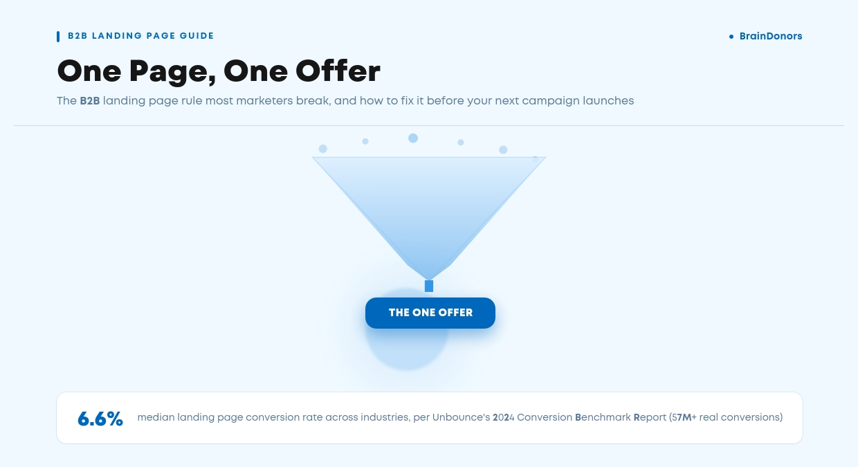
The rule that actually works is simple: one page, one offer.
One audience, one message, one action. It sounds almost too basic to write an article about, but it's one of the most consistently ignored B2B landing page best practices out there, and the data on why it matters is hard to argue with.
Here's what's actually behind the rule, what a landing page needs to do beyond just following it, and how to apply all of it without stripping your page of the context B2B buyers need before they act.
When we take over a landing page for a new client, the single most common issue isn't the copy or the design. It's that the page is quietly trying to do three jobs at once: capture a demo request, push a content download, and promote a webinar, all on the same URL.

A B2B landing page built around one page, one offer sends every visitor toward a single, specific action, with nothing else on the page competing for their attention. No secondary CTA, no “or browse our other products,” no navigation menu inviting them to wander off.
That distinction matters more in B2B than almost anywhere else. A buyer landing on your page after clicking a LinkedIn ad or a Google search result is usually mid-research, comparing you against two or three other vendors, often on behalf of a wider team that will need to sign off.
Give that person three possible next steps and you've handed them one more thing to decide, on top of everything else they're already juggling.
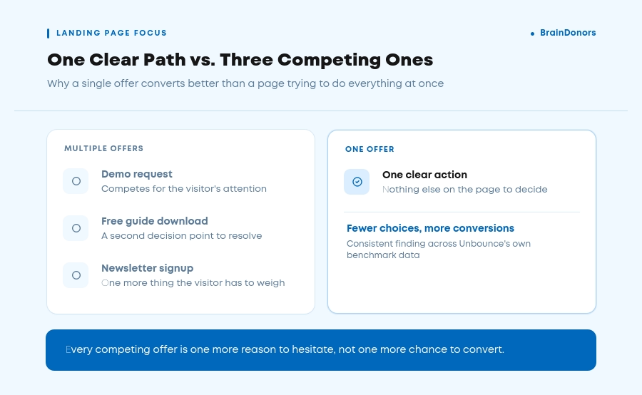
There's a name for what happens next: choice paralysis.
The more options a visitor has, the more effort it takes to pick one, and the easier it becomes to pick none. A report analyzing over 57 million real conversions across 41,000+ landing pages puts the median conversion rate at 6.6% across industries.
Its findings point to the same short list of habits behind the pages that beat that median: one message, tight message match with the ad that brought the visitor there, and nothing extra competing for the click.

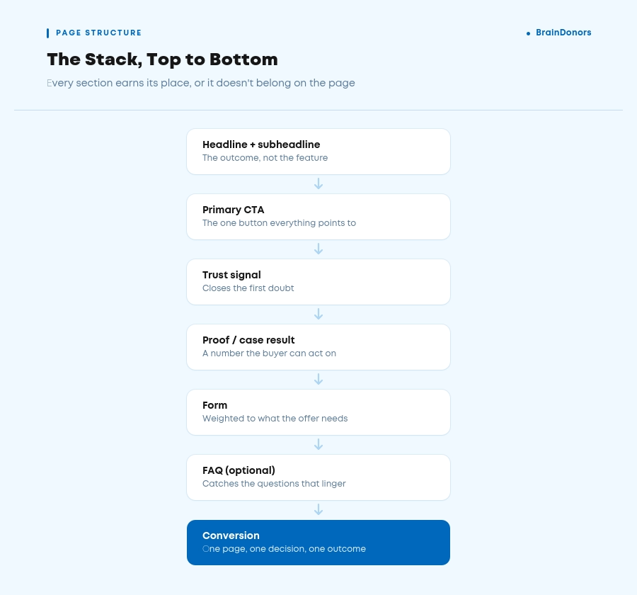
In practice, holding to one offer comes down to two decisions: one call to action, and one path to it. The button can appear more than once on a longer page, but every instance has to lead to the same place, not “Book a Demo” at the top and “Download the Guide” halfway down.
Here's roughly how the rest of a page like that should stack, section by section, before we get into each piece in more depth:
We get asked constantly whether shorter forms convert better. The honest answer is: it depends what you're optimizing for. Most B2B landing pages should ask for the fewest fields the sales team can actually work with, not the fewest fields possible.
The general conversion data is unambiguous. HubSpot's own analysis of form field types found that longer text areas and drop-down fields drag conversion down more than simple single-line fields do, and a separate widely referenced HubSpot benchmark found that cutting a form from 11 fields down to 4 lifted conversions by 50%.
Open-ended fields like “How can we help?” tend to add friction without adding useful data too, since visitors either skip them or abandon the form trying to figure out what to write.
Reducing form fields is one of the fastest wins available, but it's not automatic. The volume-versus-quality trade-off is real, and it's the part most “shorter forms always win” advice skips over.
The short form still wins on raw form fills. But once you follow those leads further down the funnel, the two approaches land in roughly the same place, because the qualifying questions on the longer form were filtering out poor-fit leads before sales ever touched them.
Message match is the direct thread between what a visitor clicked and what they land on, sometimes called ad scent in performance marketing. The ad headline, the email subject line, and the landing page H1 all need to say essentially the same thing, in close to the same words.
Many reports make the same point: matching your landing page messaging to the ad that brought the visitor there is one of the most reliable ways to lift conversion rate, no full redesign required.
Getting message match right is one of the easiest B2B landing page best practices to fix, and one of the most costly to ignore.
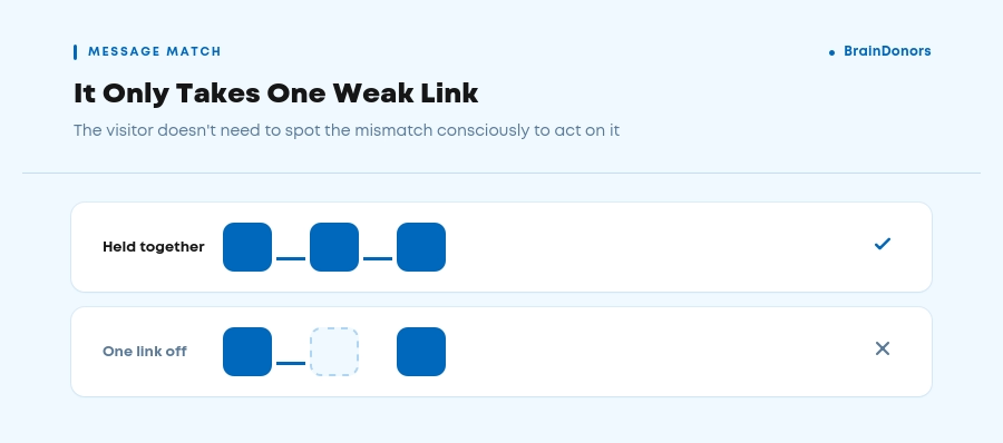
Break that thread and you lose the visitor before they read a single line of body copy. If someone clicks a LinkedIn ad promising “Cut onboarding time by 40%” and lands on a page headlined “Welcome to [Product],” their brain registers a mismatch, even if the page eventually gets to the same point. That half-second of doubt is often enough to bounce.
This is also why the one-offer rule and message match reinforce each other. A page can only match its ad copy cleanly if it's built around one specific promise.
In our own work at BrainDonors, this is a principle we come back to constantly: the offer should stay consistent across the whole journey, but how big an ask we make of the visitor has to match how much intent they already have.
A high-intent Google Ads click and a cold LinkedIn ad click aren't the same visitor to us, even when they land on pages selling the same thing.
In our experience, the further down the funnel a visitor already is, the more direct we let that ask be. Someone who's actively searching for exactly what a client offers has earned a stronger, more direct CTA.
Someone who's never heard of the brand hasn't, and asking anyway just gives them a reason to leave.
It's a rule we hold every landing page we build to: stop asking every visitor for the same thing. Match the size of the ask to the size of the intent already in the room, and let the traffic source tell you which one you're dealing with.
Who is actually reading your landing page first? It's rarely the final decision-maker. B2B decisions are made by a group of people, over weeks, with different people weighing different concerns, which is exactly why a page can follow every structural rule in this article and still underperform if it's speaking to the wrong version of the buyer.
That means “know your audience” has to go further than a persona document with a job title and a pain point on it. When we're scoping a new landing page, one of the first things we ask a client for is sales call recordings or discovery notes, because the exact words a prospect uses to describe their problem rarely match the language marketing defaults to.
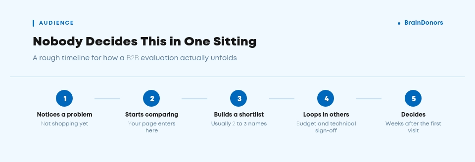
Before you write a word of copy, you need clear answers to:
The goal isn't to cram all of that into the page. It's to let it decide what one sentence goes in the headline, what one objection gets addressed above the fold, and what proof point actually matters to this specific reader. A page built on a real answer to those questions will out-convert a better-designed page built on a generic persona, every time.
A landing page and a homepage do fundamentally different jobs.
Your homepage has to serve everyone, from existing customers to job applicants to buyers at every stage of the funnel, so it keeps its navigation and never commits to one offer. A landing page has exactly one job: convert the person who arrived from one specific source, for one specific reason.
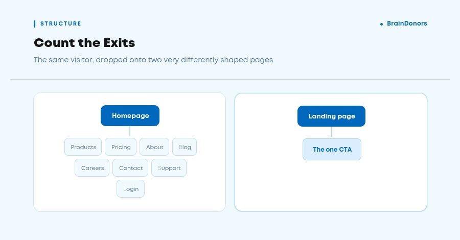
Plenty of B2B paid campaigns still point straight at the homepage instead of a dedicated page, wasting an expensive, high-intent click on a page that was never built to close it.
Specialized, campaign-specific landing pages consistently outperform generic ones, which is part of why we treat landing page and web design work as inseparable from the SEO and paid strategy driving traffic to it. If your homepage is currently doubling as your only landing page, that's usually the first fix, before touching copy or design.
Everything a visitor needs to decide whether to keep reading has to be visible before they scroll, without the page feeling cramped or rushed. These are core landing page design principles, but they only work alongside everything else here. For a B2B audience specifically, that means:
Trust signals do a specific job on a landing page: they close the gap between “this sounds credible” and “I believe this enough to hand over my details.” B2B buyers are naturally more skeptical than consumers, because a bad vendor choice reflects on them professionally, not just personally.
Getting trust signals right is one of the B2B landing page best practices most often skipped entirely, even though it's simple to add.
Not every trust signal carries the same weight, and B2B pages tend to overuse the wrong ones while underusing the ones that actually move the needle. When we build a trust section for a client, we start by listing every objection their sales team hears on calls, then match one signal to each objection instead of defaulting to a generic logo bar.
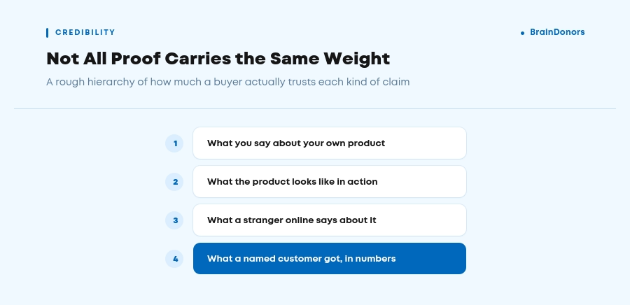
The common thread: every trust signal on the page should answer a specific doubt, not just fill space. Hard numbers and case results also pair well with a real case study, if you have one that matches the visitor's industry. If you're not sure which doubt matters most, that's usually the same answer your audience research from the section above already gave you.
A landing page still has to earn organic or paid visibility, even when its main job is conversion, not ranking. This is where a lot of CRO-focused advice quietly breaks: stripping a page down to one offer and one CTA doesn't mean stripping it of the content that lets it actually get found.
The keyword still belongs at the top of the page, in the H1 and ideally the first H2 or subheadline, written the way the visitor would search for it, not the way your product team names the feature internally.
Supporting semantic terms can live in the body copy and FAQ section without turning the page into a keyword-stuffed wall of text. This is the same intent-mapping logic behind a solid B2B SEO strategy, just applied to a single, high-intent page instead of a whole site.
The practical rule: everything that helps the page get found should also help it convert once someone arrives. A well-written FAQ section, for instance, can pick up long-tail search queries and double as objection handling for the visitor who's already on the page.
That's demand capture and conversion optimization solving each other's problem, instead of competing for space.
Before you publish, run your page against every one of these B2B landing page best practices one more time:
● One offer, one CTA, repeated but never duplicated with a second action
● Navigation removed or minimized
● Headline matches the ad, email, or search query that brought the visitor there
● Copy reflects a real answer to who's reading, what influences them, and their biggest silent objection
● Form length matches the offer's weight, not a generic rule of thumb
● CTA visible above the fold, repeated further down on longer pages
● At least one trust signal placed against the specific doubt it needs to answer
● Main keyword in the H1, with supporting terms used naturally, not stuffed
● Page built for one audience segment and one campaign message, not stretched across several
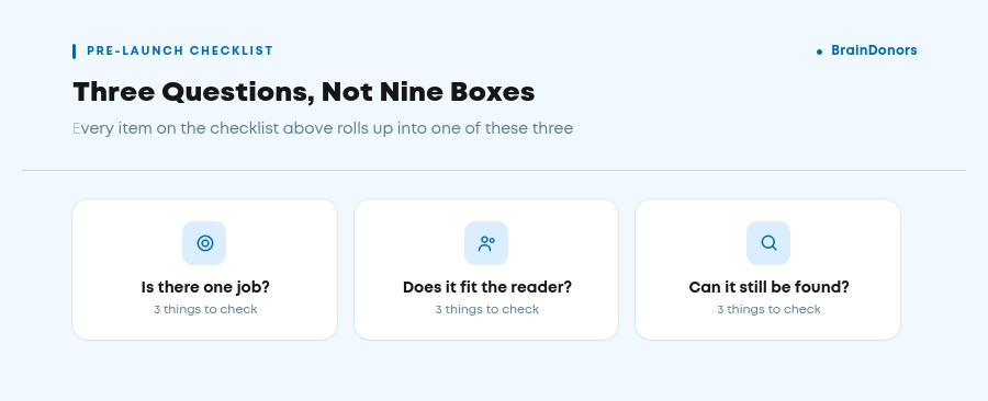
The one page, one offer rule is one of the most reliable B2B landing page best practices you can apply. It's a discipline: build every page around one decision, understand exactly who's making it and why, and remove everything else that gives them a reason to leave, or do nothing at all. It's also one of the fastest, cheapest fixes available, because it rarely requires a redesign, just a willingness to cut.
If you're not sure whether your current pages are actually following it, that's usually easier to spot from the outside than from inside your own funnel.
In almost every case, yes. Your landing page has one job, and a nav bar gives visitors an easy way to leave before completing it. The one exception is a landing page meant to build brand trust over a longer, multi-visit B2B sales cycle, where a stripped-down nav can work.
Most B2B landing pages convert somewhere between 2% and 5%, though that varies heavily by offer and traffic quality. A tightly focused page built around a single offer, with message match and a short form, routinely lands well above that range. Compare your own numbers against pages with a similar offer type rather than a flat industry average.
Only if pricing is simple enough to state without a sales conversation, like a flat per-seat rate. For complex, custom, or enterprise deals, showing a “starting at” range, or skipping pricing entirely and letting the CTA lead to a conversation, usually converts better than a number that can't capture the real cost.
Long enough to answer every objection your specific offer raises, and not a line longer. A simple ebook download might only need a few hundred words. A landing page for a five-figure annual contract usually needs proof, pricing context, and objection handling further down the page. Matching length to the size of the decision is one of the more flexible B2B landing page best practices, since there's no fixed word count that works for every offer.
Yes, and a small, well-chosen set tends to outperform a long wall of quotes. Testimonials with a name, a photo, and a company logo carry more weight than text-only quotes, and they work best placed right before the CTA, at the exact moment a visitor is deciding whether to trust you.