Contributors


Your SaaS website gets traffic. The analytics dashboard looks healthy. But the demo calendar is still half empty, and sales keeps asking where the good leads are.
We hear this from SaaS teams all the time. In most cases, the leaks happen somewhere between the first click and the booked call.
This guide covers 12 reasons B2B SaaS websites fail to convert. For each one, you'll see what it looks like, how to diagnose it with data you already have, and the fix we recommend.
A few are familiar. Others sit outside the website itself, which is why most lists of B2B SaaS website best practices miss them.
Before you fix anything, you need to know whether you have a problem. That depends on which number you're looking at.
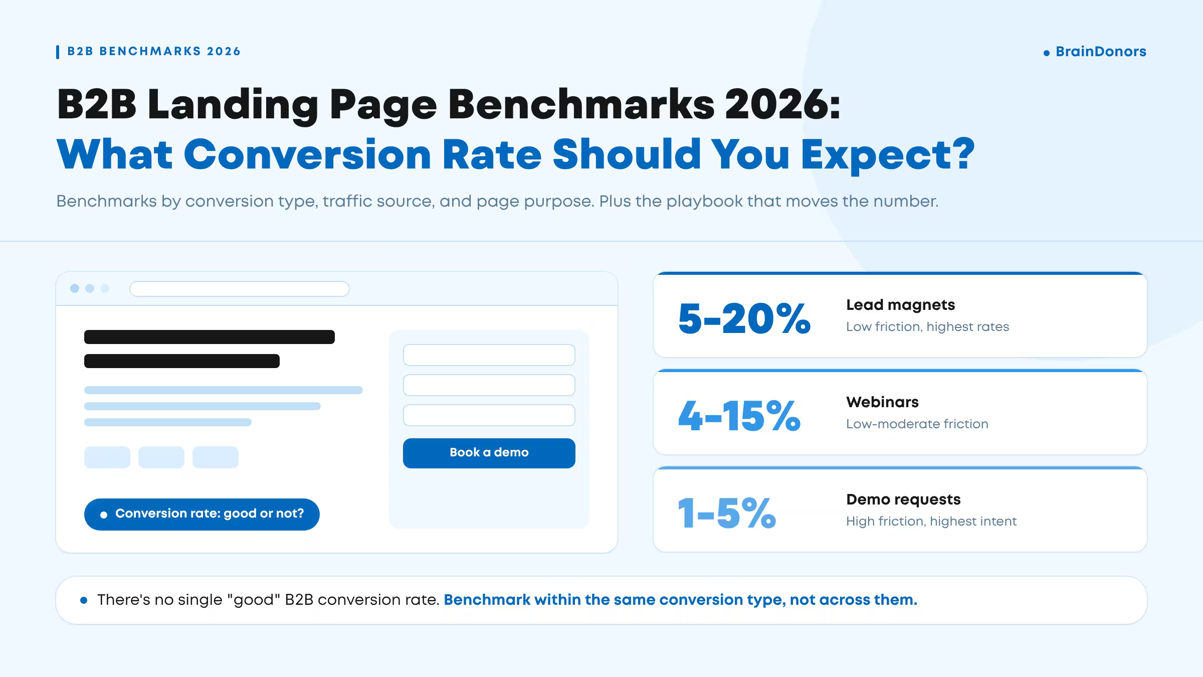
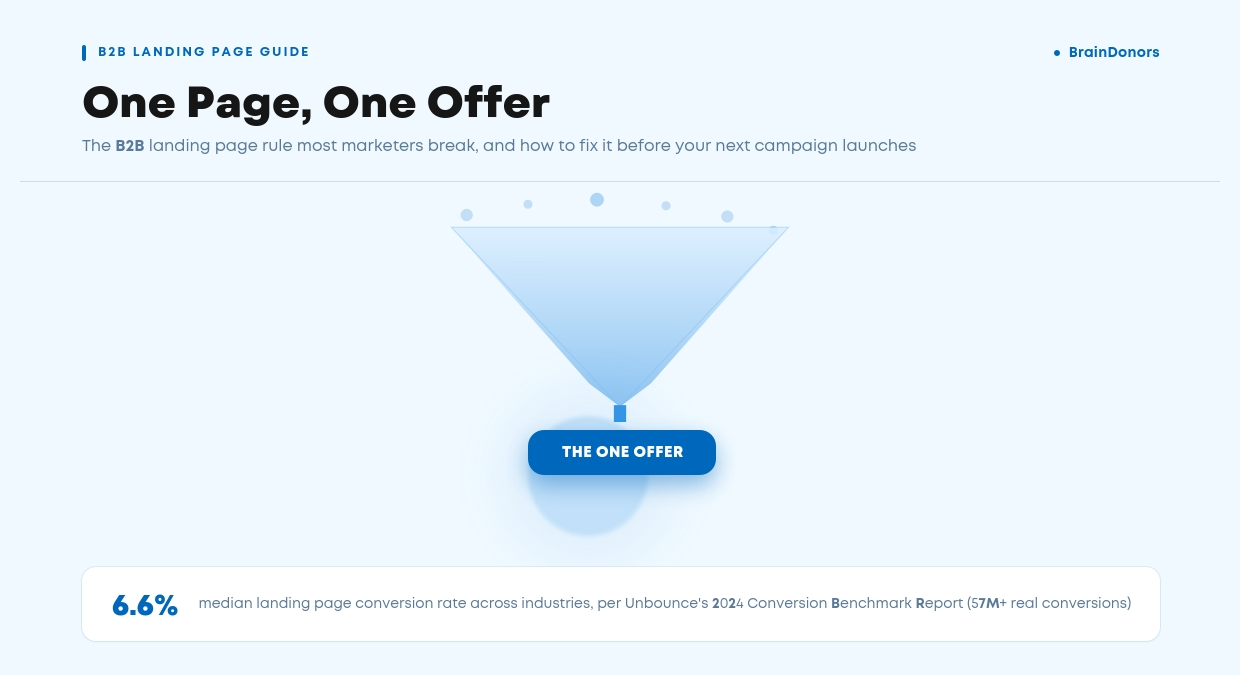
Recent 2026 conversion rate benchmarks, based on more than 5 million tracked conversions across 13 industries, put the average for software companies at 7.6%. Ruler counts a conversion as a qualified lead or sale, including form fills and phone calls, so it measures leads in general, with demo requests as only one part of the total.
The same data shows how much the traffic source changes the picture for software companies:
Treat any published benchmark with care. Definitions, samples and tracking methods differ between reports and even between years of the same report, and Ruler itself notes its 2026 averages are notably higher than in previous years.
Your own trend line is the benchmark that matters most. A 3% site-wide rate could be a healthy mix of high-intent traffic, or it could be strong branded search propping up paid campaigns that barely convert.
So the first step in any SaaS website conversion rate review is to split the number by traffic source, by landing page and by conversion type. A newsletter signup and a demo request should never sit in the same bucket.
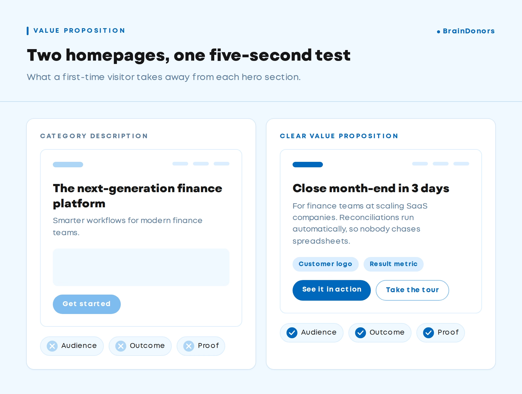
What it looks like: A homepage headline such as "The all-in-one platform for modern teams" or "AI-powered workflow automation". It's accurate, and it could belong to 200 other companies.
How to diagnose it: Show your homepage to someone in your target audience for five seconds, then hide it. Ask what you sell, who it's for and why it's better. If they can't answer all three, the headline isn't doing its job.
In GA4, compare engagement rate and scroll depth on the homepage for new and returning visitors. A big gap usually means first-time visitors don't get it. A recent research shows the first 10 seconds of a visit are when people are most likely to leave, so that is your window.
How to fix it: A strong value proposition answers three questions in the headline and subheading: who it's for, what changes for them, and why they should believe you. Put the outcome in the headline and the mechanism (how the product does it) in the subheading.
Here is a simple before and after to show the difference:

What it looks like: Feature pages full of internal terms like "unified data fabric", "orchestration layer" and "enterprise-grade extensibility". Product teams love these words because they're precise. Buyers skim past them because they can't tell what they mean for their working day.
How to diagnose it: Run your key pages through a readability tool such as Hemingway Editor. Then pull five recent sales call transcripts and list the words prospects use to describe their problem.
Compare the two lists. The gap between them is often the gap in your conversion rate.
How to fix it: Rewrite in your buyer's language and lead with the outcome. Keep the technical detail for the people who need it by moving specs, integrations and architecture to dedicated pages or expandable sections.
Use short sentences and one idea per paragraph. If you need a technical term, explain it the first time it appears.
Technical buyers are happy to read plain English. What frustrates them is decoding marketing copy to find out whether your product fits their stack.
If your team is too close to the product to write this way, an outside view helps. Our SaaS copywriting work starts with customer interviews and call recordings for exactly this reason.
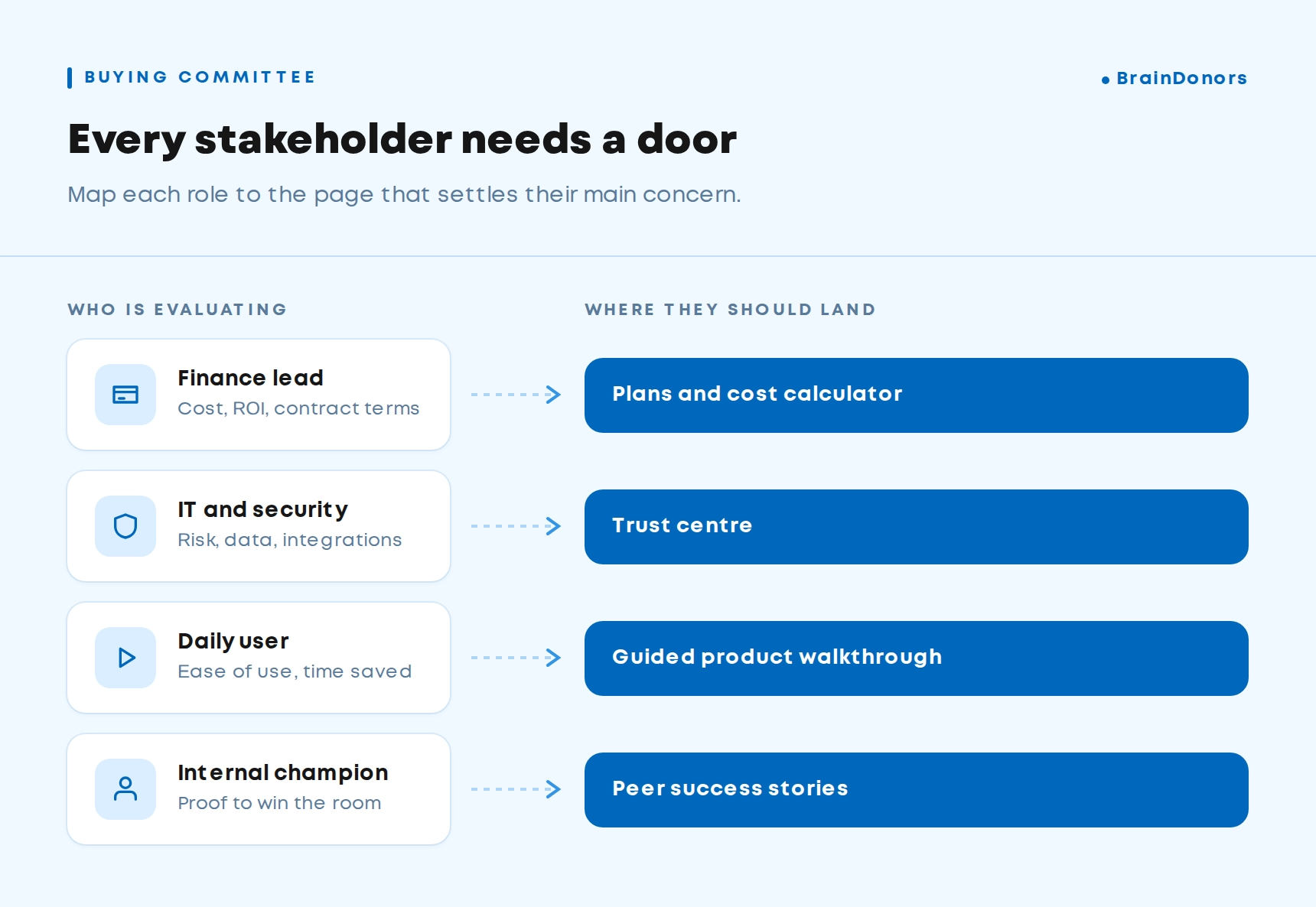
What it looks like: One homepage and one set of feature pages for everyone. The CFO checking cost, the IT lead checking security, the team lead who will use it daily and the champion who has to sell it internally all land on the same pages. Each one scans for their concern, doesn't find it quickly and leaves.
How to diagnose it: Look at the pages visitors view before converting, using GA4 path exploration or HubSpot attribution reports. If nearly every conversion comes through one generic path while solution or industry pages get little traffic, your site isn't giving each role its own entry point.
Also ask sales which questions come up on every first call. Each one is a question your website failed to answer.
How to fix it: Build a clear path for each segment. That usually means:
This is the practical side of B2B website personalisation. You don't need dynamic content tools to start. You need pages that match the real people in the buying committee.
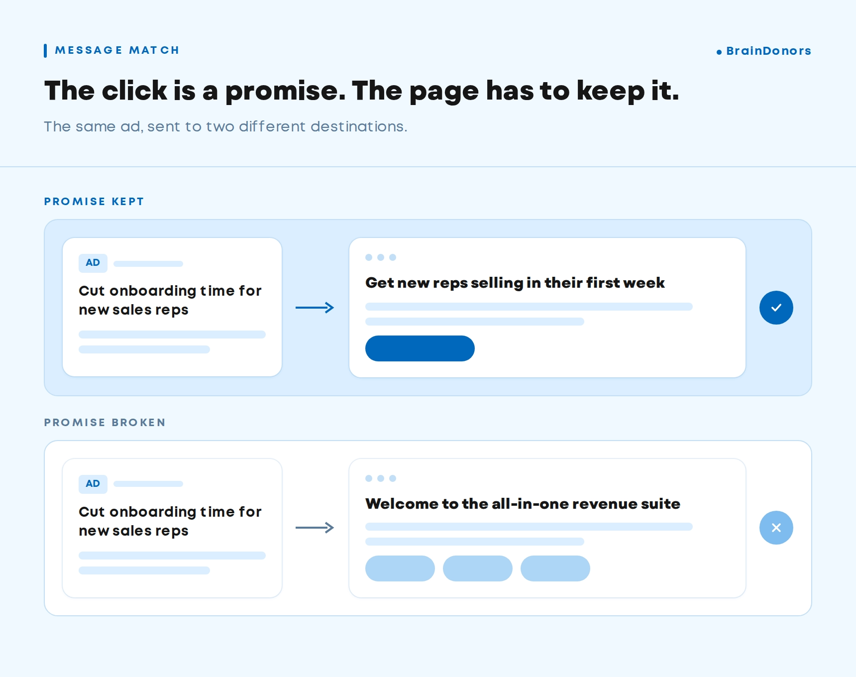
What it looks like: Paid search clicks land on the homepage. A LinkedIn ad promising a security checklist drops people on a generic features page. Visitors searching a comparison query land on a blog post with no next step.
How to diagnose it: In GA4, build a report showing conversion rate by landing page and session source. Look for pages with high traffic and low conversion, and for paid campaigns pointing to the homepage.
Then read your top ads next to their landing pages. If the promise in the ad isn't the first thing visitors see on the page, you've found a mismatch.
How to fix it: Every high-intent source needs a page built for it. The headline should continue the message of the ad or search query, and the page should answer the visitor's next question instead of repeating what they already clicked on.
Commercial pages such as comparisons, alternatives and use cases carry more conversion weight than blog posts, so point high-intent traffic there. We cover this in more detail in our guide to building a B2B Google Ads strategy.
Wisdom, a VC-backed US company offering dental billing and insurance management, came to us with exactly this problem. Its website lacked landing pages built for conversion, so even when traffic arrived, few visitors converted.
We restructured their Google Ads around high-intent keywords, wrote targeted ad copy for dental clinics and improved on-page relevance alongside ongoing SEO. Conversion rate rose by 150%, CTR doubled, and impressions grew from 369K to 989K. Here is how Wisdom increased its conversion rate.
What it looks like: "Book a demo" in the header, the hero, the middle of the page and the footer. It's the only way forward, so visitors who are three weeks into their research and not ready for a sales call have nowhere to go.
Why it matters: B2B buyers now do most of their research alone. One Buyer Experience Report found the split between independent research and seller engagement is now about 60/40, and the vendor buyers prefer before contacting sellers wins 80% of deals.
A new survey found 67% of B2B buyers prefer a rep-free experience. If a sales call is the only next step, many buyers stay anonymous until they've already chosen someone.
How to diagnose it: Compare how many visitors reach your pricing, product and case study pages with how many convert. High engagement with low conversion usually means people are interested but the ask is too big for where they are.
How to fix it: So how many CTAs should a B2B SaaS website have? One primary CTA per page, plus one lower-commitment secondary option.
The primary stays consistent across the site (demo or trial). The secondary fits the page: an interactive product tour on feature pages, an ROI calculator on the pricing page, a relevant case study on industry pages.
Keep it to two. Five competing buttons make the decision harder, and a hard decision usually ends in no decision.
Early-stage buyers will happily take the second option, and someone who watched your tour is a far warmer retargeting audience than an anonymous visitor. We explain how to use that signal in our piece on segmenting retargeting by engagement depth.
What it looks like: A pricing page with three tiers and "Contact us" in every column. Or no pricing page at all.
Why it matters: Should a B2B SaaS website show pricing? For most SaaS companies, yes, in some form. A research found 81% of buyers want to find pricing information on their own, and 43% said they delay and keep researching when they can't.
In a report, transparent pricing was buyers' number one wish-list item for vendors for the fourth year in a row. When buyers can't find a price, most assume you're expensive, or they go looking for a third-party estimate that may be wrong.
How to diagnose it: Check the exit rate on your pricing page and where visitors go next. A high exit rate with few demo requests from that page suggests it raises more questions than it answers. Also ask sales how often "roughly how much is this?" is the first question on a call.
How to fix it: Show at least one of these: starting prices, price ranges by tier, or the factors that drive cost (seats, usage, modules). Add a short FAQ on the pricing page covering contract length, onboarding fees and discounts, and place your strongest ROI proof right beside it.
In that case, explain how pricing works, give a typical starting point and show what's included. Buyers accept "it depends" when you tell them what it depends on.
What it looks like: A logo wall on the homepage, a testimonial that says "Great team, great product!", and case studies buried three clicks deep in a resources menu.
Why it matters: A 2026 report found 74% of buyers use reviews to inform purchase decisions, and buyers ranked demos, free trials and user reviews among the most influential resources when choosing a vendor. Buyers trust peers more than vendors, so your job is to bring that peer voice onto your pages at the moment of doubt.
How to diagnose it: For each key conversion page (pricing, demo request, main solution pages), check whether there is specific proof within one scroll of the CTA. Specific means a named company, a role and a measurable outcome.
How to fix it: Of all the B2B website best practices on this list, this one is often the quickest to apply:
What it looks like: A demo form with 11 fields, including a free-text "Tell us about your project" box, phone number, company size, budget and a dropdown with 25 industries.
Why it matters: The usual advice is to cut fields. The data is more nuanced. When HubSpot analysed more than 40,000 customer landing pages, conversion rates dropped only slightly as simple single-line fields were added.
The fields that really hurt were multi-line text boxes and dropdown menus. Asking someone to write a paragraph or scroll a long list takes far more effort than typing a company name.
How to diagnose it: Use form analytics in HubSpot, Hotjar or Microsoft Clarity to see where people start the form and where they abandon it. The field where drop-off spikes is your problem field.
How to fix it:
Most of this can be set up inside your CRM. If you run HubSpot, our team can handle HubSpot forms, enrichment and progressive profiling for you.
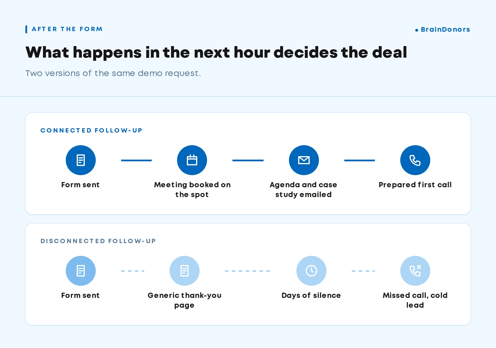
What it looks like: A visitor fills in the demo form, sees "Thanks, we'll be in touch" and hears nothing for two days. Or a rep calls while they're in a meeting, and the call is never returned.
Why it matters: This is the most expensive leak on the list, because you've already paid to get the lead. Harvard Business Review audited 2,241 US companies and found the average response time to a web lead was 42 hours, and 23% never responded at all.
The same research found that companies contacting leads within an hour were nearly seven times more likely to qualify them than those that waited even one hour longer.
How to diagnose it: Submit your own demo form from a personal email address and time what happens. Then pull the average time from form submission to first sales touch in your CRM. If you can't pull that number, that's a finding too.
How to fix it: Let qualified prospects book a meeting directly on the thank-you page, with routing to the right rep by region or company size. Send an instant confirmation email with a short agenda and one relevant case study. For leads who don't book, set up an automated follow-up sequence and a clear response time target for sales.
When Imagen AI, a global leader in AI photo editing, launched a sales-led channel alongside its product-led model, we built the full lead-to-closed-won process in HubSpot, including lead handoff and connected revenue reporting. The team hit 100% of its management targets in the first year.
See how Imagen built its sales-led growth engine, or explore our RevOps services.
What it looks like: The website promises "live in two weeks". The sales engineer says six to eight weeks is typical. The pricing page lists a feature the rep calls "on the roadmap".
Why it matters: Buyers notice. A study found that 69% of B2B buyers report inconsistencies between information on a vendor's website and what sellers told them. Each inconsistency costs trust at the exact moment a buyer is deciding whether to sign a contract with you.
How to diagnose it: Ask two or three reps to read your homepage, pricing page and top solution page, and flag anything they would correct on a call. Listen to recorded calls for moments where reps walk back a website claim.
How to fix it: Keep one messaging document that marketing and sales both work from, covering positioning, claims, proof points, pricing logic and implementation timelines. Review key pages against it every quarter and after every product or pricing change.
This belongs at the centre of your B2B website strategy. When the website becomes the source sales is happy to quote, buyers hear the same story at every step.
What it looks like: Four-second load times, a hero video that stutters on mobile data, a pricing table you have to pinch and zoom, and a chat widget covering the CTA on small screens.
Why it matters: The idea that B2B buyers only browse on desktop is out of date. First visits from a LinkedIn ad, a shared Slack link or an email newsletter often happen on a phone.
Speed matters too. A Google-commissioned Deloitte study found that a 0.1-second improvement in mobile load times lifted retail conversion rates by 8.4%.
On luxury sites, progression to the contact page rose by 20.6%. These are consumer brands, but the pattern applies to any site asking visitors to take a next step.
How to diagnose it: Run key pages through PageSpeed Insights and check Core Web Vitals in Google Search Console. Then open your demo page on your own phone, on mobile data, and try to book a meeting. Time it.
How to fix it: A few SaaS website design tips make the biggest difference here:
Designing for mobile first is one of the most overlooked B2B SaaS website design best practices, because most internal reviews happen on a laptop.
Energo Pro isn't a SaaS company, but its project shows what a technical clean-up can do. The company ran three outdated websites, which we merged into one, with a rebuilt architecture, a new user journey and HubSpot integration.
Site speed improved by 50% and average session duration rose 2 to 4 times. Read about the Energo Pro website rebuild or see our approach to B2B web development.
What it looks like: The monthly report says conversions are up 40%. Most of them are newsletter signups and ebook downloads. Demo requests are flat, and nobody can say which pages actually create pipeline.
Why it matters: If every form fill counts the same, you'll optimise for the easiest ones. That's how teams end up with more leads, a busier sales team and no extra revenue. Optimising a SaaS website to increase conversion starts with knowing which conversions matter.
How to diagnose it: Check how your analytics define a conversion. Then check whether form submissions reach your CRM with their source and landing page attached. If you can't trace a closed deal back to the page that created it, you can't tell which pages to fix first.
How to fix it: Separate macro conversions (demo requests, trial signups, contact sales) from micro conversions (content downloads, tour views, newsletter signups) and report them separately. These are the SaaS website conversion rate optimisation metrics worth tracking every month:
The same applies if you're launching a new B2B website. One of the most useful best practices for launching a new B2B website is to set up tracking, CRM integration and conversion definitions before launch. It's very hard to prove a redesign worked when the "before" data was never captured properly.
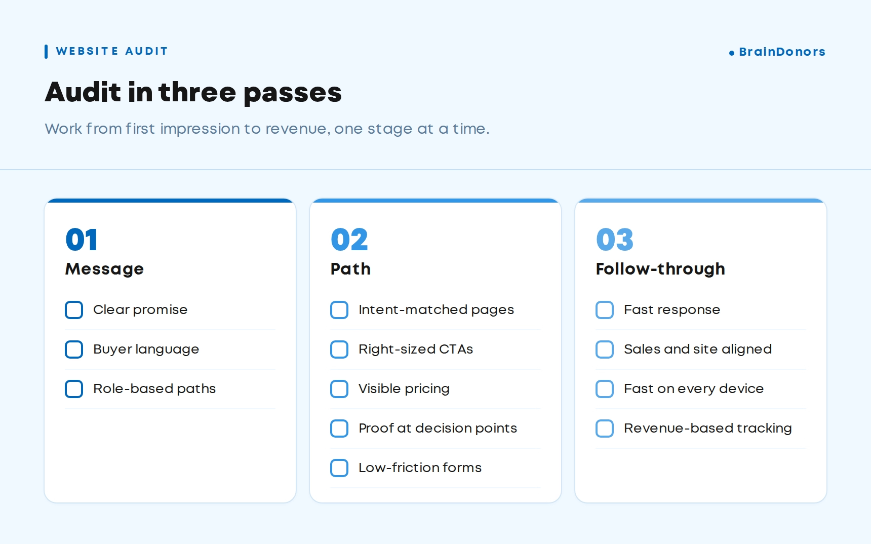
If you want to find your biggest leak this week, work through this table. Start with the rows where you can't answer the quick check with confidence, and use the B2B website metrics in the last column to track progress.
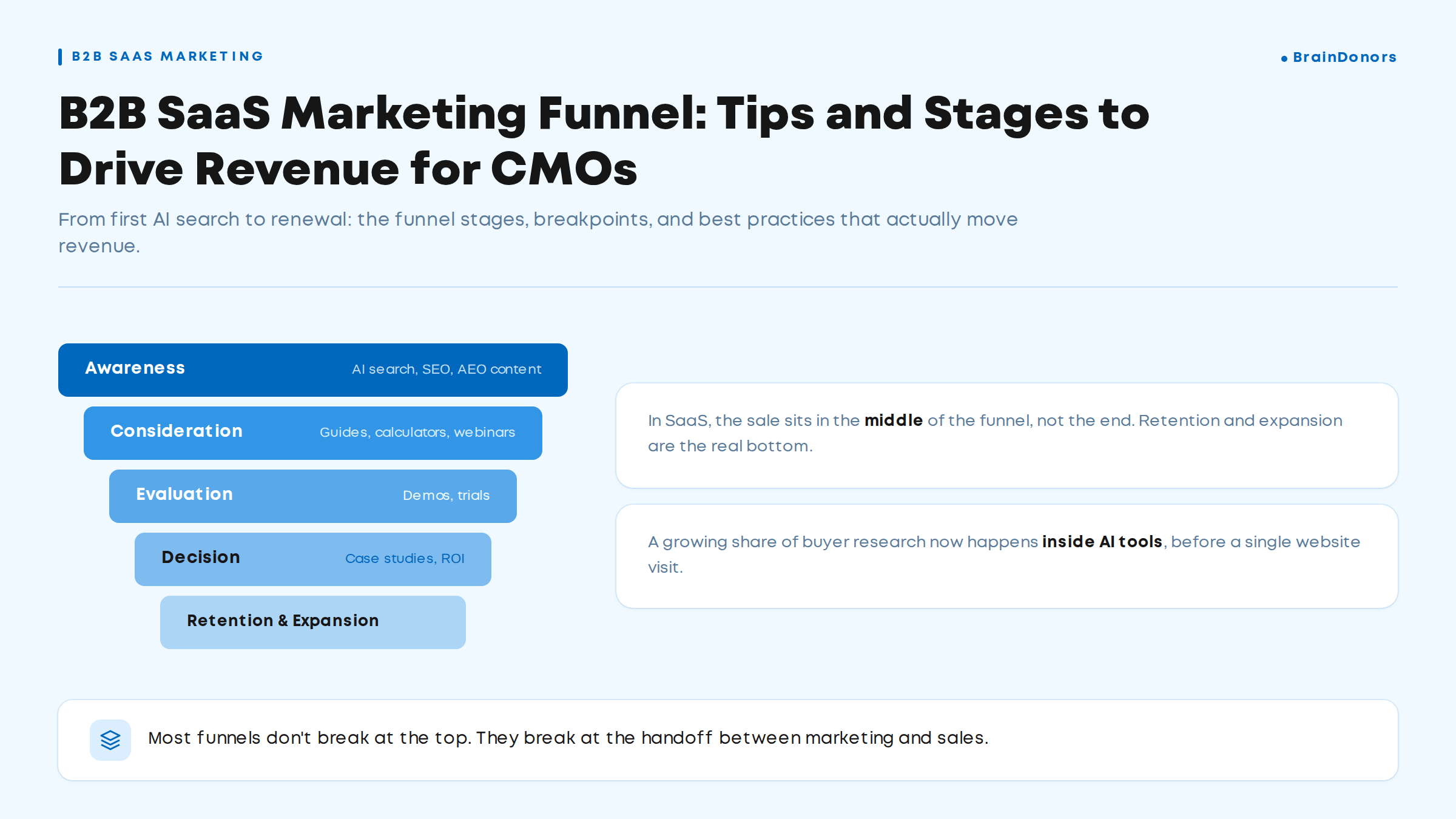
Most SaaS websites have three or four of these problems at once. Fix the ones closest to revenue first. Post-form follow-up, pricing and landing page match usually pay back fastest, because they affect people who were already close to buying.
Treat these B2B SaaS website best practices as a working checklist you revisit every quarter. Buyers, products and pricing change, and the website has to keep up.
It's usually a mix of unclear messaging, the wrong traffic landing on the wrong pages, and a single high-commitment CTA. Start by splitting your conversion rate by source and landing page. That shows whether you have a site-wide messaging problem or a mismatch on specific pages.
A headline that says who the product is for and what changes for them, a subheading that explains how, specific proof near the top, and one primary CTA with a lower-commitment alternative. It should also route each visitor type quickly to the right solution, industry or pricing page, because most buyers won't convert on the homepage itself.
Start with strong SEO foundations. Google states that SEO best practices still apply to AI Overviews and AI Mode. Then make your pages easy to quote: clear answers near the top, specific facts, public pricing and comparison pages, and consistent product information across review sites. This matters more each year. Gartner found 45% of B2B buyers used AI during a recent purchase, and Ruler Analytics' data shows AI referral traffic converting at 7.9% for software companies. Our answer engine optimisation team works on exactly this.
Run a full audit once or twice a year, plus a lighter quarterly check of your top landing pages, pricing page and forms. Also audit after any major change, such as a new pricing model, a redesign, a new product line or a large campaign launch.
Gate content only when it's worth the exchange, such as original research, detailed templates or tools. Keep guides, case studies and product information open, because buyers use them to build their shortlist. Gating everything slows their research and fills your CRM with contacts who aren't ready to talk.